Posts

Showing posts from October, 2017

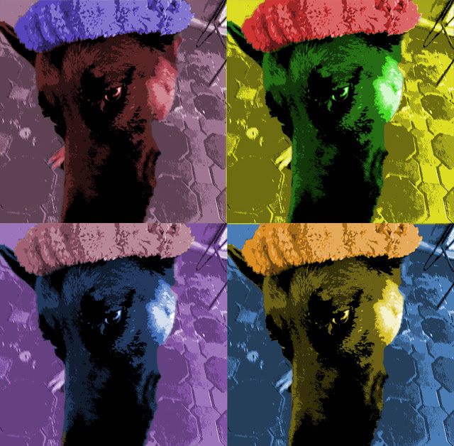
Exercise 10 - Principle of Design - Unity/Variety - Unity and variety in Andy Warhol Art

Image

Exercise 10 - Principle of Design - Unity/Variety - Unity and variety in a word

Image

Exercise 10 - Principle of Design - Unity/Variety - Definition

Image
Unity: occurs when all of the elements of a piece combine to make a balanced, harmonious, complete whole.  variety:  a way of combining visual elements to achieve intricate and complex relationships

Exercise 9 - Principles of design - Balance - Examples of balance

Image
Symmetrical balance: this is actually a symbol from a game (assassin creed). you can that this symbol or logo has the same thing on each side. the two sides are identical. And it really feels like a mirror. Well, symmetrical balance stands for formality and dullness but in this logo, it shows how formal is it and how well organized is it too. from:  https://goo.gl/images/95Khqy asymmetrical balance: the artist has taken a really good and obvious view of those pines. there is a big pine on the left or you can say it is near. whatever that makes it look bigger. and on the right, there are 3 little pines which can lead us to say that it has equal visual weight. so that makes it balanced for the viewer and the photographer as well. it gives the photo a kind of enjoyment and interesting mood from:  https://goo.gl/images/BaKs5Y    Radial balance: it is actually based on circles and it achieves visual balancing by circles too. And th...

Exercise 9 - Principles of design - Balance - Balance in design

Image
I think my design is balanced. so as you can see I drew a bike on the right which is one object and then on the left I drew two objects: a lantern and a basket full of food. If the basket was empty this picture won't be balanced so that is why I drew a basket full of food.

Exercise 9 - Principles of design - Balance - Definition

Image
the sense of the distribution of perceived visual weights that offset one another

Exercise 8 – Elements of Design ‐ Color - Color in art

Image
Morning and night. I chose analogous color scheme and used black and white for the shadows and highlights   from:   https://goo.gl/images/xCWBqf

Exercise 8 - Elements of design - Colors - Monochromatic Triptych in Photography

Image
The color scheme is primary. I chose three colors: red, blue and yellow.

Exercise 8 - Elements of design - Colors - Definition

Image
he property possessed by an object of producing different sensations on the eye as a result of the way it reflects or emits light.

Exercise 7 - Elements of Design - Value - value in drawings

Image

Exercise 7 - Elements of design - Value - Value scale

Image

Exercise 7 - Elements of design - Value - Definition

Image
The lightness or darkness of tones or colors

Exercise 7 - Elements of design - Values - Value in photography

Image
This picture was captured from snapchat (people channel)

Exercise 6 - Elements of design - Texture - Texture in photography

Image
As you can see in this picture, there is a woody texture in the back. It is actually a table that is shaped and sculpted just like a tree trunk, that is why it has got this stunning look. For the three frogs, they've got a mixture texture between stony and woody. they actually seem like a rock. The shadows and the shading in the woody table make it more like a marvelous texture and add dimension to the photo. I chose the black and white filter because it makes the photo better, and it captures the depth and the texture better than any other colors. 
Exercise 6 - Elements of design - Texture - Texture in drawing

Image

Exercise 6 - Element of design - Texture - Definition

Image
Texture: The feel or appearance of a surface or a substance these pics are from google